Til Nord
Til Nord is a creative studio built on purpose and direction — a belief that every idea should have a North Star. The goal was simple: create a brand mark and system that embodied movement, clarity, and story. I created visual identity that feels both grounded and aspirational.
Creative Direction, Design, UX/UI & Content Production.
Core Colors


Brand Line
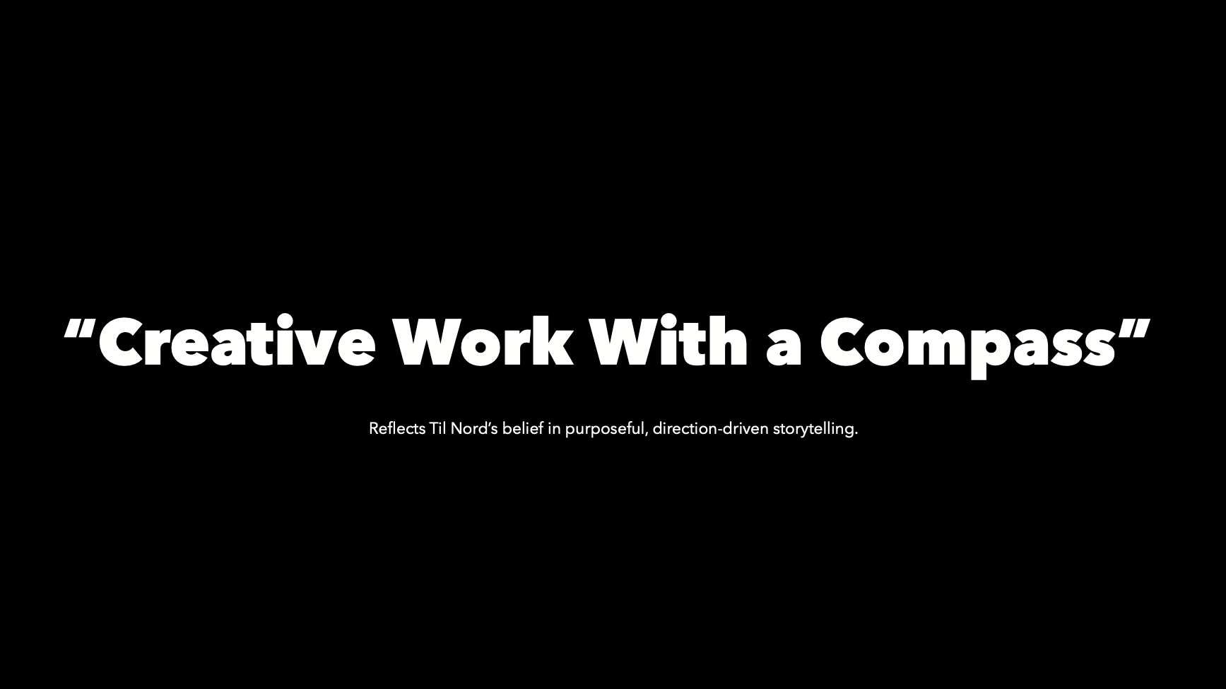
“Creative Work with a Compass”

Visual Foundation


Behind the Mark
The Til Nord identity was crafted to mirror the studio’s philosophy: purposeful creativity guided by clear intent. Every design choice tells part of that story — from the name itself (“To the North”) to the mark that represents forward motion and perspective.
The logo balances storytelling and simplicity, allowing the brand to flex across motion, print, and digital without losing its sense of clarity. Paired with a short, declarative tagline — Creative Work with a Compass — the identity speaks with confidence, precision, and warmth.

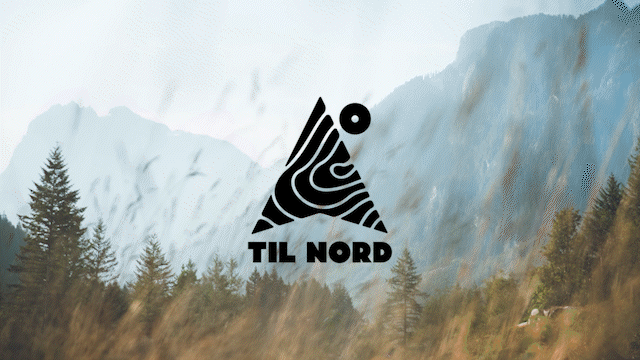
logo
The logo combines an upward arrow for direction and True North, a degree symbol in the “O” to represent precision and 360° thinking, and a topographic texture to ground the identity in nature and cinematic storytelling. Together, these details form a visual compass — one that reflects Til Nord’s approach to creative exploration and purposeful storytelling.

Tagline & Verbal Identity
The core tagline, “Creative Work with a Compass,” reflects Til Nord’s philosophy that every idea needs direction and purpose. It positions the studio as both a creative partner and a guide — leading brands toward clarity through story and design.
Paired with the secondary line, “We help brands find their True North,” the voice becomes both aspirational and actionable. It speaks to brands seeking meaning in their storytelling and consistency in their identity — blending artistry with intention.