KitchenAid
Color of the Year
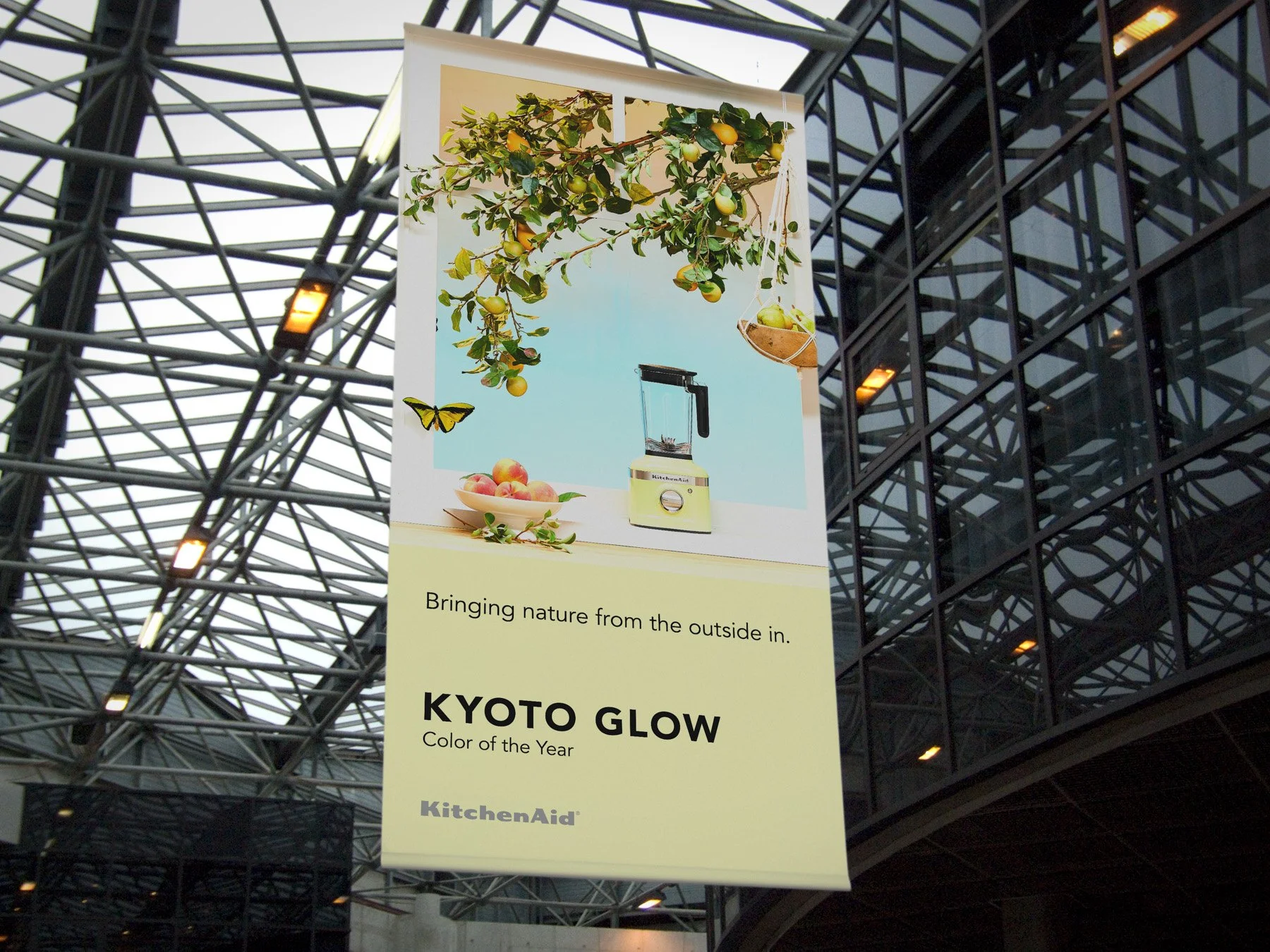
Kyoto Glow, a Color of the Year Campaign for KitchenAid. Inspired by the tranquility and calmness of Japanese scroll art, the campaign aimed to inspire makers worldwide, transforming their kitchens into revitalizing sanctuaries for creativity and renewal. Creative used across KitchenAid USA, Europe, Australia & New Zealand to launch a brand new color.
Creative Production

Concept & Inspiration
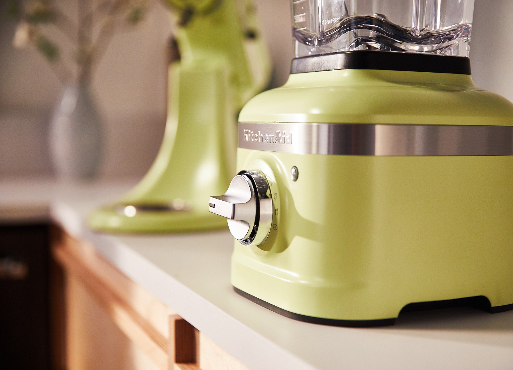
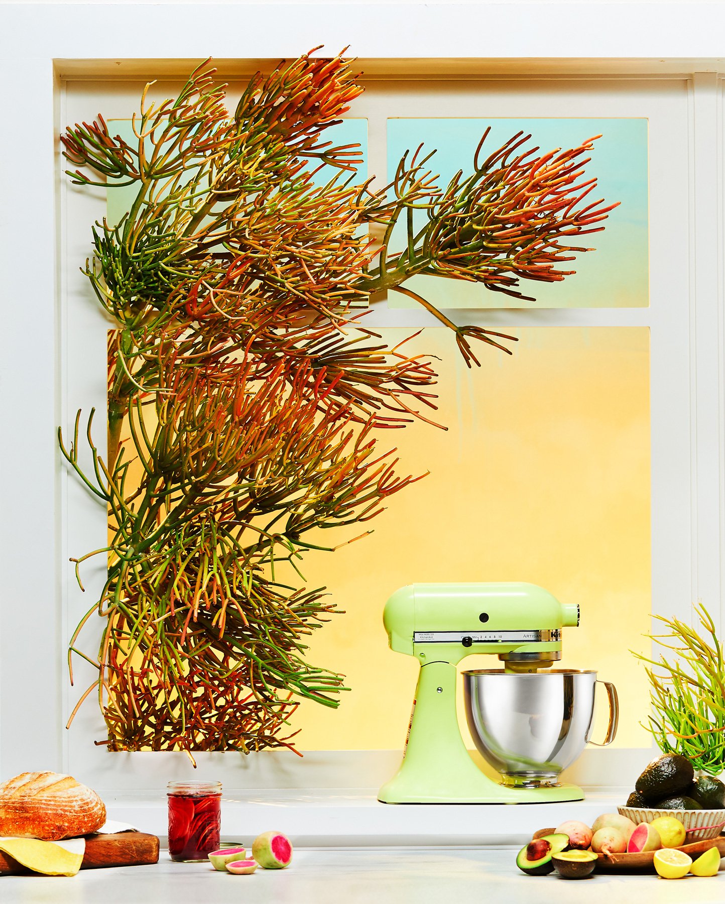
Kyoto Glow was designed to embody balance, tranquility, and renewal. Inspired by Japanese scroll paintings, the campaign embraced a more conceptual and artful approach—positioning the color as both energizing and calming.

Production
Working closely with KitchenAid’s agency and brand creative directors, I oversaw photography direction across multiple teams and partners. From custom lighting design to nuanced post-production, every detail was crafted to preserve the depth, texture, and intentionality of the color.


GLobal Launch
The campaign rolled out across the U.S., Europe, Australia, and New Zealand, becoming one of KitchenAid’s most successful Color of the Year launches. The imagery not only introduced Kyoto Glow but also deepened customer connection through emotional, lifestyle-driven storytelling.


Creative used across KitchenAID usa, Europe, AUstralia & New Zealand to launch a brand new color.